 |
| photos 1/4/7 designletters - 2/3/5/6 elvs |
If you follow me on IG you might have seen that I had an amazing week...
These last few days I have spend a great time with my family at the dutch coast
and another highlight for me of last week was my visit to Kopenhagen where I was
invited on behalve of fonQ.nl to join the presentation of the two brand new collections of
Danish brand Design Letters & friends, that we all know of their Arne Jacobsen’s typography
products (incl. mugs, porcelain plates, tea towels, stationery and much more)
invited on behalve of fonQ.nl to join the presentation of the two brand new collections of
Danish brand Design Letters & friends, that we all know of their Arne Jacobsen’s typography
products (incl. mugs, porcelain plates, tea towels, stationery and much more)
While having a delicious lunch at the Alberto K restaurant at the SAS Royal Hotel,
Mette Thomphon founder of Design letters started the presentation by telling us
about how the story of the two sides of Arne Jacobsen was born.
Two years ago Arne Jacobsen’s grandson Tobias called Mette and asked her
if she would be interested in having a closer look at some of his grandfathers
more unknown designs and drawings. More precisely, it was a box filled
with old textiles featuring Arne Jacobsen’s pattern design.
In this box there were two types of patterns - Two sides of Arne Jacobsen:
A floral side with lots of flowers and detailed drawings of vegetation and
a more classic side of Arne Jacobsen, as most people know him:
Geometric and abstract patterns with a strong reference to modern architecture.
Mette had the box for several months and finally ended up picking out the
Nordic Anemone (windflower) pattern, which Arne Jacobsen drew in the 1940s
during his exile in Sweden. As a counterpoint to this Mette choosed a geometric
pattern that Arne Jacobsen originally designed for the carpet,
for the SAS royal hotel. A pattern that has become the base of the new
AJ Royal Vntage collection.
After telling us the story behind the new collections Mette invited us to experience
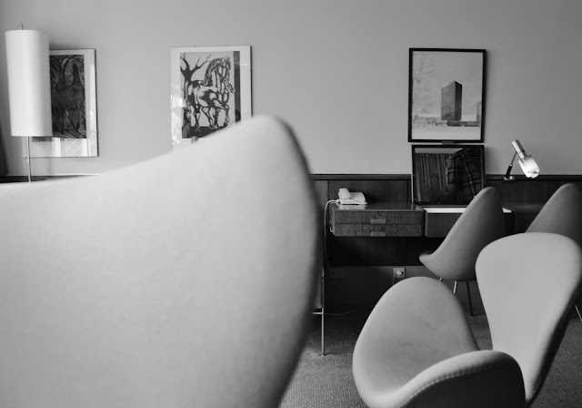
these two sides of Arne Jacobsen live: In his original suite from 1960 (room 606)
where we could see the more classic, strict side of Arne Jacobsen and where we could admire
their new AJ Royal Vintage collection and in the suite next door where we
could see a number of pieces of the Flowers collection.
The windflower pattern was originally designed by Arne Jacobsen for textile.
The windflower pattern was originally designed by Arne Jacobsen for textile.
For Designletters it was a perfect start for a textile collection as bedcovers but also for a
stationery range featuring the windflowers combined with Arne Jacobsen’s vintage typography.
The AJ Royal Vintage collection consists a beautiful throw (wool) and with the same pattern,
The AJ Royal Vintage collection consists a beautiful throw (wool) and with the same pattern,
Design letters introduced a limited edition travel notebook and a greeting card.
Also in the AJ Royal Vintage range are the beautiful black and green (inspired by the color of the walls in room 606) metal vases who where originally designed for the SAS royal hotel bar/lobby area.
More products will be added continuously to the AJ Royal Vintage collection and to
the Flowers collection... I am really looking forward to admire the new pieces
after this amazing press launch ”Two Sides of Arne Jacobsen”
you can see and read more here
thank you so much Design letters and fonQ.nl for inviting me!
you can see and read more here
thank you so much Design letters and fonQ.nl for inviting me!


